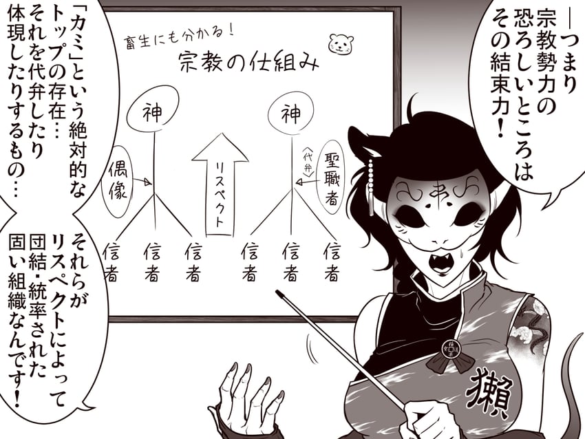
This otter spirit's mask covers like half her face.
It's also the most appealing design I've seen from Ryuuichi in a long time, and I'm very much of the opinion that's related. Imma get on my high horse and rant, but so many of Ryuuichi's characters just feel horrifically overdesigned. massive, super-complex tattoos and random face markings, faces themselves feel way too sharp with exagerrated shapes and noses used to shovel out dirt, overly defined musculature on everyone and everyone (even the right-hand fingers here look all sorts of wonky because of how they're defined), and somehow the net result gives the impression that without the face markings, you'd end up with same-faces (which is, presumably, the reason ryuuichi drifted away from the classic style in the first place.
Otter-san here works not because she defies those problems, but her design happens to tone them down. The tattoo's there but not massive, and most of the overdesigning is located on her mask, which absolutely makes sense for overdesigning to be on. Not to mention the otter snout hides the misplaced cartographical depiction of a mountain that ryuuichi pretends is a nose.
It's a shame, because while earlier Ryuuichi art had some of these issues, you can see a world line where they get tamed over time, rather than becoming more exaggerated. Take a look at this earlier series, for example. The profiles still give the impression that Reimu can carry a shopping bag home without using her hands, but the relative less-is-more makes the general sharpness of their faces still look appealing and recognizable, without running off into the sunset with the crazy details.
It's not like he can read english or anything, so i don't know why I'm ranting about this, but... y'know. just had to get it off my chest with the upload dump, i guess.
 otter_tail pointer ryuuichi_(f_dragon) sleeveless sleeveless_dress solo tail touhou translation_request upper_body rating:s score:4")